- REVIEWS
- FEATURES
- CANNES 2026
- LIFESTYLE
- GLOBAL
- LISTS
- THR VIDEO
For Satyajit Ray, films were born out of an artistic necessity, where brush and lens came together to script a fusion that was intensely personal yet consumingly professional. Over the course of establishing himself as India’s leading filmmaker across four decades, Ray’s understanding and grasp over other art forms was evident in the way he brought it all together under the same umbrella for each of his films.
One of the most intriguing aspects of Ray’s creative process in the making of a film was the art. His moving images spoke of clarity of thought, mental templates and artistic control. Alongside his artwork on magazine covers, stories and novels, Ray’s art was an intrinsic part of his films’ universes. Often arriving as neatly stitched wrappers, like the ones that one hesitates to open, his posters stand testimony to the radical artistic styles he toyed with — bringing forth a unique alchemy of indigenous and Western art forms. His idea of colours, patterns and silhouettes differentiated him from his contemporaries. This is evident right from Pather Panchali in 1955 to his swansong, Agantuk, in 1992, where his posters captured the mood of each film, the undertones, his vision and the audience’s imagination in the same breath. Most of his contemporaries preferred playing by the book when it came to posters and promotional material, often focusing on the use of greyscale, simple cut-outs and slight variations of the same style across decades. But Ray indulged a child-like restlessness, shuttling between contrasting styles, vivid colours, abstract forms and infrequent imageries from one film to the next.

Speaking to The Hollywood Reporter India, director Sandip Ray, his son and member secretary of the Satyajit Ray Society, recounts, “He approached everything with an incredible visual sense and an idea of what would work and what wouldn’t. Numerous movies were being made, but something about his posters captured the eyes of the masses.” Sandip remembers posters used to be designed for kiosks with two dimensions working on either side — 30-by-40 inches and a smaller one of 20-by-30 inches. Beyond the kiosk, the bigger poster was intended for the urban space, while the smaller one was designed to cater to the mofussil. The process began with buying paper of these exact dimensions, following which design materials were sourced, elements were adjusted according to size, pastings were done manually, and were finally printed on lithographs or silk screens.
Having observed the process from the closest possible quarters, Sandip speaks of how his father personalised a cumbersome process of poster-making with an obsession fuelled by his love for art, “He loved what he did and had a unique gift of knowing what would pull the eye of a passer-by. It was a completely solo process for him, till technology started [advancing]. Be it artwork for films or newspaper advertisements, he knew exactly what would work.”
At a later stage of Ray’s career, the process was shared between father and son. “I started working on alternate posters, booklets and other material while he took on the primary posters. It was a fun experience working in adjacent rooms, exchanging ideas and seeking approval,” says Sandip with a laugh; over the past few years, he has been heavily involved in the restoration and conservation of Ray’s posters and artwork on paper.
Ray’s posters acted like evocative prologues. Besides the two primary ones, the art behind the film’s posters included multiple alternatives for different markets, booklet covers and newspaper advertisements. With the art, Ray consciously created a brand identity for his films. Dr. Pinaki De, an award-winning graphic designer and Ray scholar, believes the auteur was a pioneer of poster-making in India. He dives into the world of Ray’s posters and speaks of how Ray’s professional experience in the world of advertising played an important prelude. “He knew how important it was to advertise a film and how to create maximum impact with his posters. For his debut Pather Panchali, the use of a very strategically placed billboard and one of the largest posters of the era ensured intrigue and attention, contributing much to the success of the film in Calcutta,” he says.
To take a panoramic view of Ray’s posters and filmography, it is important to factor in the prevalent technology, or the lack of it, and his deft understanding of the same. With everything done according to size, the 30-by-40-inch posters were usually printed on lithographs while the 20-by-30-inch ones usually employed silk screens, making them more visually striking. De talks of Ray’s usual practice of frequenting G.C. Laha, a famous fine-art material shop in Calcutta to source paper, which kickstarted the creative and manual process. “Initially an exclusively solo process for the first decade, Ray was helped by a man named Bidyut Chakraborty from Charulata (1964) onwards, and certainly his son became a part of the process from 1980, contributing significantly to the process,” De mentions.
For Ray, all components of a poster had to be in perfect harmony. Fonts, paper cuttings, colours or shapes — every element contributed equally to the artistic brilliance of his posters. According to De, the lettering on Ray’s posters has played a crucial role in threading together overtones and crafty allusions to the story and the characters.
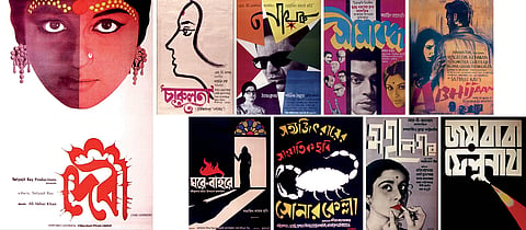
Chiriakhana (1967), an adaptation of Sharadindu Bandyopadhyay’s story of the Byomkesh Bakshi series, starring Uttam Kumar as Bakshi, was Ray’s first venture into the world of detective thrillers. “The 20-by-30 poster of Chiriakhana is a fine example of simplistic bold lettering speaking volumes. A chain of words is punctuated by a close-up of Kumar’s bespectacled sleuth-like eyes, floating cut-outs of faces and a striking hint of dripping red highlighting the second part of the last word, which translates to a bloody murder — the core element of the story. One can observe a slight influence of Bauhaus, the German school of art, on the poster,” De points out.
A study in minimalism, Charulata’s 20-by-30 poster on a lithograph features the protagonist in a side profile, drawn by Ray with a single brush stroke. Offsetting that is the ornate detailing of the title, written in Bengali, offering a contrast of styles. In an interesting choice, again highlighting Ray’s desire to keep experimenting with art, he avoids pictures or conventional front profiles, to evoke a sense of longing and stillness of the female gaze — which are central elements in the story.
Ray’s masterful use of lettering to amplify the literal sense of words is seen on the 30-by-40-inch poster of Jana Aranya (1976) and the 20-by-30-inch poster of Mahanagar (1963). “Ray’s use of overlap and sense of jarring maximalism play into the name, Jana Aranya, which translates to ‘human jungle’. For the latter, the curious verticality of the Bengali lettering of the title alludes to the skyscrapers and concrete towers of Calcutta where the name Mahanagar translates to ‘The Big City’,” De observes. Ray’s idea of liberating femininity and emancipation through the years is also significantly brought out on the Mahanagar poster where the cut-out of the protagonist’s face, played by Madhabi Mukherjee, is in focus, with the use of bold red lipstick symbolising emancipation and choice. De also points out an interesting feature in the poster of Jana Aranya: “There was an acute paper shortage around 1975–76, and 30-by-40 posters could not be made. Dissatisfied with the prospect of designing only 20-by-30 posters, Ray discovered that 30-by-40 could be used for calendars. If one looks carefully, there is an astutely placed three-month calendar etched at the bottom of the 30-by-40 poster. That is how precise he was!”
Ray’s understanding of what appealed to the intended cross-section was rare. This was proven with his use of highly appealing, abstract yet unconventional imagery on the posters of Goopy Gyne Bagha Byne (1969), a children’s film, to appeal to younger eyes. The iconic promotional sketches of Bhooter Raja (The King of Ghosts), a character in the film, has become an immortal and emblematic representation of the world of Satyajit Ray.
Ray’s fluidity could be studied by a constant shift of forms from one film to another, or between two posters of the same film. Although displaying a recurring usage of signature patterns — like the Fibonacci sequence — while placing facial cut-outs, motifs and lines, it is not possible to define a period by a common style or form. His use of singular motifs occurs across decades, the use of which, although often visually tangential, was successful in tickling the intrigue of the mass.
For instance, Ray’s uncharacteristic charcoal sketching and perspectival lettering on a very rare 30-by-40-inch English poster of Abhijan (1962) and the floating cut-out of Soumitra Chatterjee’s emotive face circled by pointed fingers of accusations on the 20-by-30-inch poster of Ganashatru (1990) are iconic usages of the same. The brilliant use of chiaroscuro on the poster of Ghare Baire (1984) — where the motif of the threshold and the shadow become a metaphor for the figure of the woman about to step into the unknown — is another incredible example.
“With Sonar Kella’s (1974) 30-by-40-inch poster, Ray went beyond the obvious and safe, and employed paper cut-outs to put together visually arresting lettering with an almost badge-like motif of a scorpion, an element of the story. He interestingly avoided the central character, Feluda, played by Soumitra Chatterjee, or the safe bet of using the picturesque Rajasthan as the backdrop on the poster,” De points out.
The poster often synonymous with Ray is the 20-by-30-inch one of Devi (1960), where style, lettering and motif blend to form an interesting cocktail of allusions. Crowned by the face of Sharmila Tagore portraying the female protagonist, the dream-like dual tonality of the face alludes to the split identity of the central character, as the dutiful daughter-in-law and the goddess Kali. “The lettering of the name in Bengali, with the almost centrifugal architectural rays forming the arches of a temple and a halo defining the holistic nature of the poster, was an absolute jump of genius,” De emphasises.
The other interesting aspect of Ray’s work is his use of geometry, shapes, spaces and his idea of composition to mount meaningful and striking presentations. Addressing the element of geometry, De observes, “In Nayak (1966), Ray experimented with geometry and negative space in the most radical way possible. Besides the remarkable title sequence, reminiscent of the works of German-Amercian artist and educator Josef Albers, on Nayak’s 30-by-40-inch poster Ray used paper-cut polygons with deterrent colours placed craftily to form a star-like negative space from which Uttam Kumar’s face almost explodes into the foreground, much like a film star explodes out of the crowd. The star is not drawn, it is formed, which again, makes for a major metaphor.” While the influence of artists such as Saul Bass, Paul Klee, Piet Mondrian, Benode Behari Mukherjee, Rabindranath Tagore and others are notable, Ray’s artistic sensibility was defined by a confluence of international and oriental styles and forms — from Bauhaus to Swiss to contextual modernism to folk art. This synthesis led to an individuality and peculiarity that continue to define Ray’s unique artistic pursuit. With his posters, Ray left behind a window into his psyche, one that entertains flights of fancy while remaining tethered to the reality of the business.