- REVIEWS
- FEATURES
- CANNES 2026
- LIFESTYLE
- GLOBAL
- LISTS
- THR VIDEO

When it’s Shah Rukh Khan, only the eyes are enough. That understanding guided the making of King’s pre-teaser, cut under near-secrecy, with barely any footage, and against a ticking clock that couldn’t be moved. Dropped on Khan’s birthday last month, the debut visual unit for Siddharth Anand’s much-awaited 2026 actioner was assembled in a blur of instinct, restraint and trust, by a team that knew exactly what not to reveal.
THR India spoke to the team of the creative agency MA&TH, which also designed Khan’s intense first look poster from King. Rajeev Chudasama (Director & Chief Creative Officer at MA&TH), Nilesh Kataria (Creative Director) and Ravi Dsilva (Business Head) revealed how the King assets were put together amid huge expectations (and a sea of fan edits).
Chudasama and Kataria were already deeply embedded in the film’s visual conversations long before the pre-teaser came into play. Chudasama, a close collaborator of Anand’s, says the discussions around King began early, evolving alongside the film itself.
“Sid and I are friends, so whenever he’s working on something, I’m usually sitting with him, talking through the approach. There’s a constant back-and-forth,” he says. “When we first started talking, the film was slightly different. Some big decisions were taken along the way, and the outlook changed. I was part of all those conversations, so I knew exactly where we were heading.”
But nothing about working on a project headlined by Khan is ever “easy” as the bar is set impossibly high with expectations. “If that was not enough, today you also compete with AI!”
He recalls how, months before any official assets were out, fans were already making AI versions of King. “Every day, you’d see something new. Some of it was interesting,” he admits. “So you’re not just creating curiosity anymore. You’re also competing with all of that, while keeping the intensity intact!”
Complicating matters further was a very real, very human limitation when Khan had injured his shoulder, ruling out any elaborate photo shoots. A larger campaign had been approved, but only a portion of it was suddenly usable.
“We had a locked campaign, but because of what happened, nearly a third of it was off the table,” Chudasama explains. “So we focused on what we could do. We shortlisted six strong ideas. Each had a different layer of storytelling.”
All of them were developed and explored. But as Chudasama puts it, when you’ve worked with a star for this long, you instinctively know which image will carry the weight.
“Khan saab has been around longer than all of us. At that moment, Sid, Shah Rukh and I all knew which poster would cut through. Still, you always question yourself. What if you’re wrong?”
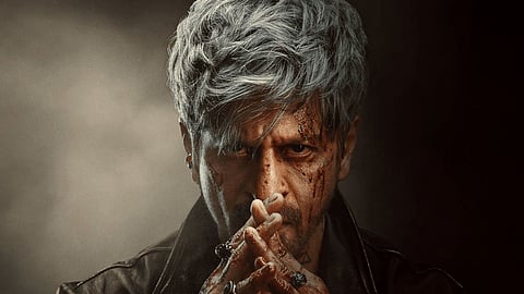
What finally emerged was striking in its restraint. A minimalist poster. Folded hands. A steady gaze. No excess. That decision was also a conscious pushback against the visual noise dominating film marketing today.
“There’s a lot of drama in posters right now. Too much of everything. Heavy Photoshop, plasticky textures, visuals that almost look AI-generated...” he says. “We were very clear we didn’t want that. We wanted his skin texture to be visible; we wanted him to feel human. The more real you keep it, the easier it is for people to connect.”
Chudasama, who has designed posters for over 750 films, says the calls he received for King were unlike anything he’s experienced. “And this was a very simple execution. I wasn’t trying to show my skills. When your subject is this strong, why should you shout over him? That understanding comes from experience.”
If the poster was about restraint, the teaser, set to a catchy background score by Anirudh, demanded precision under pressure. “Because it was extremely hush-hush, not many people knew about it. There were just four of us,” Chudasama reveals. “Shah Rukh sir, Sid, Nilesh and I.”
The footage couldn’t even be sent across. They had to work out of Anand’s office, focusing on storytelling without giving away too much of the plot. Kataria recalls how they had two days and one night to work on it, as the teaser had to be dropped on November 2.
“It was just after Deepavali, when Sid called and said, ‘Come over, watch this footage.’ I asked when he needed it. He said, today or tomorrow!” Kataria laughs and says, there was no room for overthinking, either they had to crack it, or nothing would go out on his birthday.
Khan joined them that very evening, articulating exactly what he wanted the teaser to do and, more importantly, what it shouldn’t. With the film still a year away, the mandate was to not reveal too much about King.
“They were clear they wanted to reveal the first look, but it wasn’t clear which look it would be! There was one shot that stood out to everyone,” Kataria says. “The bloodied card in his mouth. That became the reveal.”
Interestingly, that same image had also been shortlisted as a poster option but was eventually dropped to avoid repeating the same impact across formats. “We didn’t want to dilute it,” Chudasama says. “Once it existed in the audio-visual space, it had to live there. This was just a peek into the kingdom. For the rest, you have to wait.”